Introduction
Your website’s homepage is like the front door to your online business or brand—it’s the first thing visitors see, and it sets the tone for their entire experience. A well-designed, high-converting homepage can turn casual visitors into loyal customers, subscribers, or followers. That’s why getting it right is so important!
With Kadence Theme, designing a homepage that is not only visually appealing but also user-friendly and conversion-focused is easier than ever. Kadence offers powerful customization tools, drag-and-drop features, and pre-built starter templates that make it simple for beginners and pros alike to build an effective homepage without coding.
Whether your goal is to showcase your services, share a blog, or drive e-commerce sales, your homepage should clearly communicate your brand’s value, make navigation intuitive, and encourage users to take action—whether that’s making a purchase, signing up for a newsletter, or contacting you for services.
In this guide, we’ll break down how to design a high-converting homepage using the features of Kadence Theme. From crafting attention-grabbing headlines to optimizing layouts and incorporating effective calls to action, we’ll walk you through everything you need to know to create a homepage that works for your goals.
So, whether you’re starting from scratch or redesigning your current homepage, grab your favorite beverage, and let’s explore how you can make the most of Kadence Theme to design a homepage that converts visitors into engaged, loyal supporters!
Step 1: Understand the Purpose of Your Homepage

Before diving into the design process, it’s essential to have a clear understanding of why your homepage exists and what you want it to achieve. Your homepage isn’t just a collection of random images and text—it serves as the foundation of your website and communicates the value of your brand or business to your audience.
For beginners, this step is crucial because having a well-defined purpose allows you to create a strategic, user-friendly homepage that guides visitors toward taking the desired action, whether that’s learning more about your services, purchasing a product, or subscribing to your newsletter. So let’s break this step down into actionable pieces!
Why Define the Purpose of Your Homepage?
Your homepage acts as the first impression of your website. It should immediately answer the questions users have when they land on your site:
- Who are you?
- What do you offer?
- How can you solve my problem or meet my needs?
If visitors can’t quickly find this information, they may leave your site in frustration. Defining your homepage’s purpose ensures you focus on clarity, simplicity, and relevance while giving users exactly what they’re looking for.
When you define the purpose of your homepage, you can prioritize key elements like design, navigation, content, and calls-to-action (CTAs). For instance:
- An e-commerce website’s homepage might aim to showcase featured products, promotions, and direct pathways to the store.
- A personal brand might use the homepage to share the creator’s story, offer consulting services, or highlight their portfolio.
- A blog may focus on guiding users to the latest or most popular content.
Knowing the goal of your homepage helps you tailor everything—from layout to messaging—so visitors engage with the right content at the right time.
Ask Yourself: What’s the Goal of My Homepage?
When you sit down to create or optimize your homepage, answer the following questions:
- What action do you want visitors to take?
- Examples: Make a purchase, sign up for your email list, read your latest blog, schedule a call, or connect with you on social media.
- Who is your target audience?
- Understanding demographics, interests, and needs allows you to design a homepage that speaks directly to them.
- What message or value do you want to convey?
- This could be your mission statement, core values, product benefits, or a unique selling proposition (USP) that sets you apart.
Once you know the purpose, you can map out how your homepage will visually and textually communicate this to users.
How Kadence Theme Can Help You Define and Achieve This Goal
Kadence Theme offers intuitive features to help you organize your homepage with purpose:
- Pre-built starter templates that align with different website goals (e-commerce, services, blogging, portfolio, etc.).
- Drag-and-drop design blocks that allow customization to ensure your homepage reflects your brand’s unique vision.
- Powerful branding tools that help you maintain visual consistency across your homepage design.
With Kadence Theme, you can start with a professional template that aligns with your website’s goal and refine it step-by-step to make it truly yours.
Final Thoughts
Understanding the purpose of your homepage is the first step in building a successful, high-converting website. It serves as the foundation for everything that follows—from design choices to CTAs to content strategy. By clearly defining your goals and knowing the user’s journey, you create a roadmap for designing a homepage that guides visitors seamlessly toward your objectives.
Now that you understand your homepage’s purpose, you’re ready to move on to the next steps. Let’s explore how to design and structure your homepage effectively using Kadence Theme’s incredible features and tools!
Step 2: Choose the Right Kadence Starter Template for Your Homepage
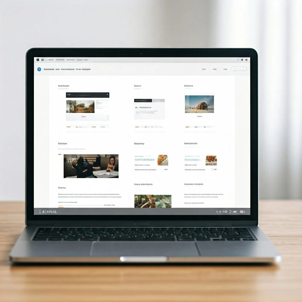
Now that you’ve established the purpose of your homepage, it’s time to move on to the next step: choosing the right Kadence starter template. If you’re new to website design, starter templates are a fantastic way to save time, reduce stress, and ensure your homepage looks professional right from the start. Kadence Theme provides a variety of pre-designed templates that you can easily customize to fit your brand or business.
What is a Kadence Starter Template?
A starter template is a pre-built, professionally designed website layout you can import with just a few clicks. These templates are designed to save beginners like you time and effort by providing ready-made designs and structures optimized for various purposes, such as blogs, e-commerce sites, service-based businesses, personal portfolios, or online communities.
Kadence starter templates are visually appealing, mobile-responsive, and easy to set up, making them perfect for anyone starting out on their website journey. They also include pre-designed sections for headings, call-to-action buttons, featured content, and more—allowing you to build your homepage much faster than creating it from scratch.
How to Choose the Right Kadence Starter Template
Selecting the right starter template is all about matching your goals and audience with the template’s features and design style. Let’s explore a few key points to keep in mind:
1. Understand Your Website’s Purpose
Is your website focused on:
- Selling products? (Look for e-commerce templates.)
- Blogging or sharing news? (Opt for templates that feature prominent blog layouts.)
- Offering services or building a personal brand? (Choose templates with service offerings or portfolio highlights.)
Kadence Theme offers templates tailored to each of these goals, helping you kickstart your homepage with purpose.
2. Assess Your Brand Style
Think about your brand’s personality and visual style. Are you going for:
- A modern and minimalistic look?
- A vibrant, bold, and dynamic aesthetic?
- A professional, sleek, and corporate vibe?
Choose a starter template that resonates with your branding and visual preferences. Kadence’s library includes a wide range of styles, ensuring you find one that matches your vision.
3. Look at the Layout and Features
Check the features included in the template. For example:
- Does it include an eye-catching hero section?
- Are there pre-designed areas for testimonials, contact forms, or a featured product showcase?
- Does the template align with your content goals and calls-to-action?
Choose a starter template that allows you to highlight what matters most to your audience while being intuitive for visitors to navigate.
How to Import a Starter Template
Once you’ve chosen the perfect Kadence starter template:
- Go to your WordPress dashboard and navigate to Appearance > Kadence Starter Templates.
- Browse the library and select the template you like.
- Click Import and follow the on-screen instructions to import the design.
Kadence makes this process simple and beginner-friendly, and within moments, you’ll have a professional, customizable homepage ready to edit.
Final Thoughts
Choosing the right Kadence starter template is a game-changer, especially if you’re new to website design. It eliminates the guesswork, saves time, and sets you up with a design that’s both beautiful and functional from the get-go. Whether you’re starting a blog, launching an e-commerce site, or promoting your services, Kadence’s starter templates provide the perfect foundation for your website.
With your template in place, you’re now ready to move on to customizing it to match your brand, content, and vision. Let’s take your homepage to the next level with the next step in this process!
Step 3: Customize Your Homepage Layout with Kadence Blocks
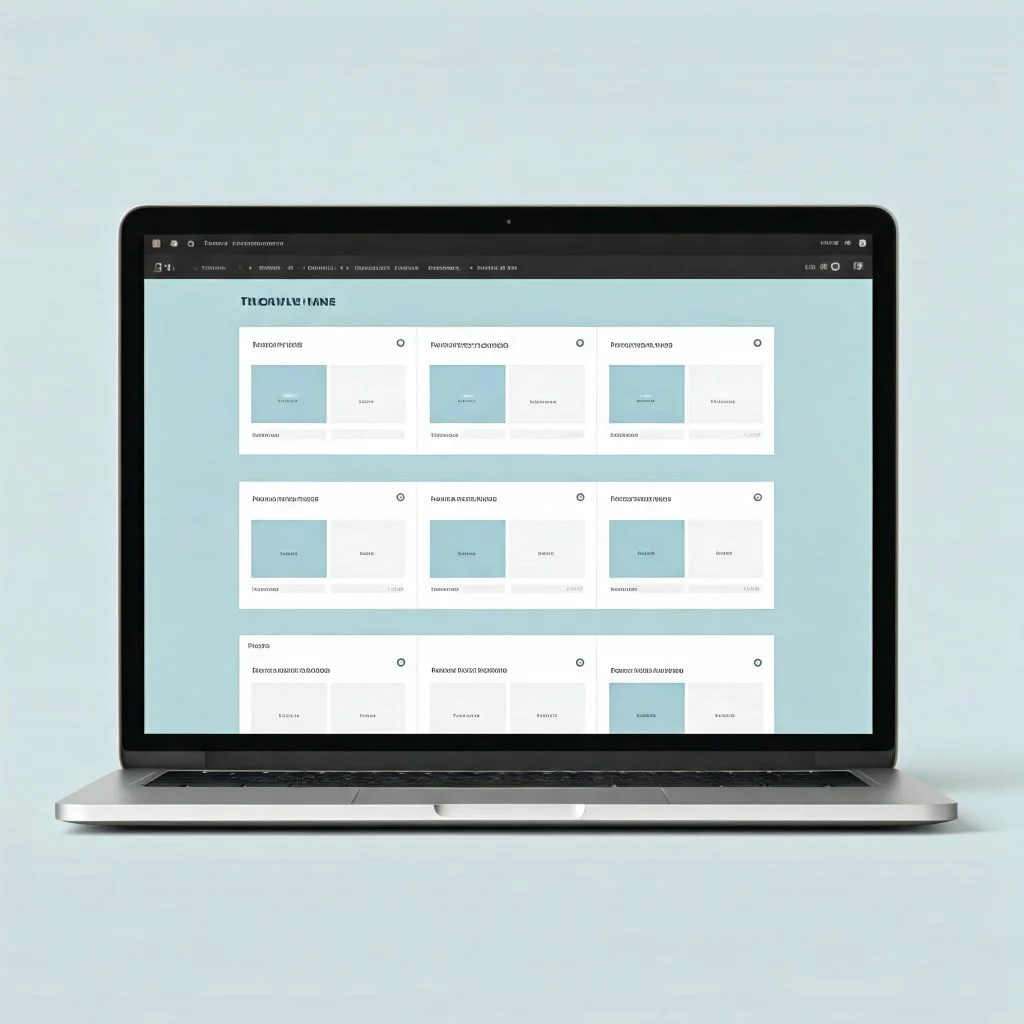
Now that you’ve selected the perfect Kadence starter template for your homepage, it’s time to make it truly yours by customizing it using Kadence Blocks. Kadence Blocks are powerful tools that allow you to edit, design, and organize the structure of your homepage without needing technical expertise or coding knowledge. They give you full control over your design while maintaining a clean, user-friendly experience.
For beginners, Kadence Blocks are beginner-friendly yet versatile, making them an excellent choice for both first-time website builders and experienced designers. They help you drag, drop, and tweak various elements to create a homepage that reflects your brand’s personality and achieves your website goals.
Why Use Kadence Blocks for Customization?
Kadence Blocks are modular building blocks designed to work seamlessly with Kadence Theme. They allow you to add, rearrange, and edit sections on your homepage easily. With these blocks, you can:
- Add and arrange design elements like headlines, images, call-to-action buttons, sliders, testimonials, or services sections.
- Build a responsive layout optimized for desktop and mobile users.
- Save time by using pre-built templates or creating unique designs without coding.
Kadence Blocks give you the flexibility to design your homepage with visual appeal while aligning with your brand identity.
Key Elements to Customize Using Kadence Blocks
When customizing your homepage layout with Kadence Blocks, focus on essential sections that make your homepage functional and engaging. Here are a few key areas to prioritize:
1. Hero Section
The hero section is the first thing visitors will see when they land on your homepage. This area should include:
- A headline that communicates your brand or value proposition.
- A subheading with additional context or a call-to-action.
- A visually appealing image, background, or slider that grabs attention.
Use Kadence Blocks’ Header, Image, or Slider Blocks to design this area and make it stand out.
2. About Section
Introduce your brand or story with a clear and concise about section. Add a brief description, an image, and possibly a button that leads to your full about page or services.
Kadence’s Text Blocks and Image Blocks make it easy to create clean, professional layouts for this section.
3. Featured Services or Products
If you’re a business owner or service provider, showcase your most popular services or products using Kadence’s Grid or Gallery Blocks. These blocks allow you to display services, products, or features visually with descriptions, icons, or images.
4. Testimonials & Reviews
Customer testimonials build trust and credibility. With Kadence Blocks’ Testimonials Block, you can easily add glowing reviews from happy clients to your homepage.
5. Call-To-Action (CTA)
Your homepage should drive users to take action. Whether your goal is for users to subscribe, purchase a product, book a consultation, or contact you, place strategic CTAs using Buttons Blocks from Kadence Blocks.
How to Start Customizing with Kadence Blocks
- Go to the WordPress Customizer:
From your WordPress dashboard, go to Appearance > Customize to access the visual editor. - Open the Kadence Blocks Editor:
Select the homepage template and click on the section you want to edit. Kadence Blocks’ drag-and-drop interface makes it simple to arrange and tweak elements. - Add or Edit Content with Ease:
Drag blocks (such as the Text Block, Image Block, or CTA Block) into your page layout. Customize their style, color, padding, and other design aspects to make them fit your brand aesthetic. - Preview Changes:
Kadence allows you to preview your edits in real-time. Use this feature to ensure your homepage looks great on all devices. - Save and Publish:
Once satisfied with your layout, save your changes and publish your homepage to make it live.
Final Thoughts
Using Kadence Blocks to customize your homepage is a fun, creative process that allows you to build a layout that is not only visually stunning but also functional and aligned with your goals. Even if you’re a complete beginner, Kadence Blocks make it simple to design like a pro—thanks to their intuitive interface and ease of use.
By focusing on sections like the hero area, about section, services, testimonials, and strategic CTAs, you can create an engaging homepage that keeps visitors interested and encourages them to explore your site further.
Next up, we’ll move on to optimizing your design even further, refining each block and ensuring everything aligns with your brand identity and user experience.
Step 4: Optimize Your Homepage for User Experience (UX)
Designing a visually appealing homepage is only one part of creating a high-converting website. The next step is to optimize your homepage for user experience (UX). User experience refers to how easy, intuitive, and enjoyable it is for visitors to interact with your website. A well-optimized homepage ensures that users can find what they’re looking for quickly, engage with your content, and take the desired action without frustration or confusion.
For beginners, focusing on UX may seem overwhelming, but it doesn’t have to be. With Kadence Theme’s intuitive design tools and smart strategies, you can make simple adjustments to enhance the user journey on your site.
Why is User Experience Important?
Your homepage is often the first interaction users have with your brand. If the user experience is poor, visitors may leave your site within seconds, leading to lost opportunities for engagement, conversions, and sales. A well-optimized homepage keeps users engaged and guides them toward the information or action they came for.
Here’s how a strong user experience benefits your homepage:
- Reduces bounce rates: Users stay longer when they can easily find what they’re looking for.
- Improves navigation: A clear and intuitive menu helps users move seamlessly through your site.
- Builds trust: Easy-to-use websites show professionalism and build credibility.
- Encourages conversions: Clear calls-to-action (CTAs) and smooth user journeys lead to increased sign-ups, purchases, or inquiries.
Now let’s look at how you can optimize your homepage for better user experience step-by-step.
1. Ensure Fast Page Load Speed
A slow-loading homepage can frustrate users and lead to higher bounce rates. Use tools like Google PageSpeed Insights to test your page’s speed. Kadence Theme is optimized for performance, but you can make it faster by:
- Reducing image sizes without compromising quality.
- Using caching plugins (like WP Rocket or W3 Total Cache).
- Avoiding unnecessary third-party scripts.
2. Make Navigation Simple & Intuitive
Your website’s navigation menu should be visible, easy to use, and organized logically. Kadence makes it easy to create a clean and responsive menu. Use a clear menu structure with categories like:
- Home
- About Us
- Services/Products
- Blog
- Contact
Ensure that your navigation menu is mobile-responsive so users on any device can find their way with ease.
3. Use Clear Calls-To-Action (CTAs)
CTAs are buttons or links that encourage users to take the next step. Whether it’s signing up for your newsletter, booking a service, or purchasing a product, CTAs should stand out and be placed strategically on your homepage. Use action-oriented, concise language like:
- “Subscribe Now”
- “Shop Our Products”
- “Learn More”
- “Get a Free Quote”
Kadence Blocks allows you to design visually appealing, clickable CTAs with ease.
4. Optimize for Mobile Devices
More than half of all website visitors come from mobile devices. Ensure your homepage looks great and functions smoothly on smartphones and tablets. Kadence Theme is inherently mobile-responsive, but you can double-check mobile responsiveness using the WordPress Customizer preview or testing your website on different devices.
5. Incorporate White Space & Readable Fonts
White space (the space around your content) makes your homepage easier to read and navigate. Avoid clutter by spacing out sections and ensuring content is scannable. Stick with clear, easy-to-read fonts and maintain a simple color scheme that aligns with your brand. Kadence allows you to customize typography and design elements to ensure consistency and readability.
Final Thoughts
Optimizing your homepage for user experience is about making it simple, intuitive, and engaging for visitors. From improving load times to designing intuitive navigation, ensuring mobile optimization, and using strategic CTAs, these small changes create a big impact on how users interact with your site.
With Kadence Theme and thoughtful UX strategies, you can create a website that doesn’t just look great but provides users with a seamless journey from the moment they land on your homepage.
Now that you’ve optimized your homepage for user experience, the next step is to focus on refining your design elements and ensuring every piece aligns with your goals and brand vision.
Step 5: Enhance Your Homepage with Visual Elements and Branding
After optimizing your homepage for user experience, the next step is to enhance it with visually appealing elements and consistent branding. Visual elements play a key role in making your website memorable, building trust with your audience, and creating an emotional connection. A visually attractive homepage with a clear brand identity helps visitors engage with your content and fosters credibility for your business or personal brand.
With Kadence Theme and Kadence Blocks, adding and customizing visual elements becomes simple—even for beginners. Let’s dive into how you can elevate your homepage with thoughtful design choices, strategic use of imagery, and cohesive branding.
Why Visual Branding Matters
Branding is more than just a logo or color scheme—it’s the personality and identity of your business translated into visuals. Your website should reflect your brand’s voice, values, and style consistently. A cohesive visual experience makes your website feel professional and trustworthy, encouraging visitors to explore more and take action.
Some key visual elements to focus on are:
- Color schemes: Colors should reflect your brand identity and evoke the right emotions.
- Typography: Choose fonts that are clean, modern, and in line with your brand style.
- Images & Graphics: Well-chosen visuals capture attention and communicate your message faster than text.
Kadence Theme allows you to integrate these elements seamlessly to make the design process intuitive and beginner-friendly.
1. Choose Your Brand Colors Wisely
Your brand colors should be consistent throughout your homepage and website. Stick to two to three main colors to keep your design clean and professional. Kadence makes it easy to select and implement your brand colors through its built-in color options.
Here are some quick tips for color choice:
- Use colors that align with your brand personality (e.g., blue for trust, green for nature, red for excitement).
- Make sure there is sufficient contrast between text and background to ensure readability.
- Test your chosen colors across all devices to ensure consistency.
2. Use High-Quality Images & Graphics
Images are one of the most powerful visual tools on any website. They can make your homepage engaging and professional while supporting your brand message. Use high-quality images that align with your business, message, or content. Here are some image-related tips:
- Choose photos that resonate with your audience (authentic and relatable visuals).
- Avoid overloading your homepage with too many images, which can slow down loading times.
- Utilize tools like Unsplash, Pixabay, or Canva for free or affordable images.
Kadence Blocks allows you to place images and sliders in strategic locations like hero sections, testimonials, or feature showcases.
3. Customize with Typography
Typography is another important visual element that impacts your homepage’s readability and style. Kadence provides numerous font options that allow you to choose clear, modern, and branded typography for headlines, body text, and CTAs. Stick with 1-2 fonts throughout your site to maintain consistency and avoid overwhelming your visitors.
When selecting typography:
- Pick fonts that are easy to read on all devices.
- Use bold typography for headlines and calls-to-action.
- Ensure that fonts align with your brand’s personality—modern, playful, professional, or creative.
4. Leverage Visual Hierarchy
Visual hierarchy organizes your content in a way that guides visitors’ attention toward the most important information first. Kadence Blocks lets you play with design elements like font size, color contrast, and section spacing to create this hierarchy.
Here’s how to create effective visual hierarchy:
- Headlines: Make your primary headline stand out by using larger text or a bold font.
- Subheadings: Use smaller text for secondary information.
- CTA Buttons: Use colors or contrasting elements to draw attention to CTAs like “Buy Now” or “Sign Up.”
5. Incorporate Branding Elements
Your logo, tagline, and other branding assets should be visible and seamlessly integrated into your homepage design. Place your logo in a prominent location (usually in the header) so visitors recognize your brand immediately. Use Kadence’s built-in options to upload and style your logo and ensure it fits well with your design.
Branding helps visitors connect with your site emotionally, improving their overall user experience and trust in your brand.
Final Thoughts
Integrating visual elements and branding into your homepage helps visitors connect with your brand, builds credibility, and creates a polished, professional design. With Kadence Theme and Kadence Blocks, you can effortlessly bring these visual enhancements to life without technical skills or advanced design knowledge.
By focusing on cohesive colors, typography, quality imagery, and visual hierarchy, you’re setting the stage for a visually compelling homepage that supports your business goals and engages visitors effectively.
With your homepage now visually optimized and on-brand, the next step is to focus on integrating SEO strategies and fine-tuning your content to attract your ideal audience. Let’s keep building![High-Converting Homepage with Kadence Theme][High-Converting Homepage with Kadence Theme]
Step 6: Implement SEO Strategies with Kadence Theme
Search Engine Optimization (SEO) is essential for driving organic traffic to your website. SEO ensures that your website ranks higher in search engine results, making it easier for potential visitors to find you. With Kadence Theme, implementing effective SEO strategies is straightforward—even for beginners. The theme comes with built-in features that can improve your website’s visibility and ensure it aligns with SEO best practices.
In this step, we’ll explore how you can optimize your homepage and overall website using Kadence’s SEO tools and techniques. By focusing on strategic adjustments and keyword optimization, you can improve your chances of reaching your target audience and growing your website’s presence.
Why is SEO Important for Your Website?
SEO is the foundation of online visibility. When users search for a product, service, or topic, search engines like Google display results based on relevance, authority, and user experience. If your website is optimized, it will show up higher in these search results—leading to more clicks, engagement, and opportunities to convert visitors into customers or followers.
Here are the key benefits of optimizing your website with SEO:
- Increased visibility: Helps users discover your website when they search for relevant keywords.
- Builds credibility and trust: Websites that rank higher are often perceived as more trustworthy.
- Drives organic traffic: Unlike paid advertising, SEO brings in visitors without additional costs.
- Long-term growth: Good SEO strategies offer sustainable results over time.
With Kadence Theme’s SEO-friendly options, optimizing your homepage and content becomes simpler.
1. Optimize Your Homepage with Keywords
Keywords are the backbone of SEO. They are the terms and phrases users type into search engines to find information. To optimize your homepage:
- Identify relevant keywords for your business, niche, or industry using tools like Google Keyword Planner or Ubersuggest.
- Incorporate these keywords naturally into headings (H1, H2), subheadings, and body text.
- Use keywords in strategic areas like your hero section, about section, and call-to-action sections.
For example, if you own a fitness coaching business, your homepage might include keywords like “fitness coaching services,” “personal trainer,” or “home workout plans.”
2. Use Kadence’s SEO Options for Optimization
Kadence Theme offers SEO-friendly features right out of the box. Here’s how you can use them:
Meta Titles & Descriptions:
Ensure your meta titles and descriptions are optimized for each page. These elements tell search engines and users what your page is about. Kadence allows you to set meta information easily using its built-in options.
Responsive Design:
Search engines like Google prioritize websites that are mobile-responsive. Kadence’s responsive features ensure your website looks great on any device, improving user experience and SEO rankings.
Schema Markup:
Kadence Theme supports schema markup, which provides search engines with more context about your website. This can lead to rich snippets (like star ratings or featured images) appearing in search results.
3. Optimize Images with Proper Alt Text
Images are essential for creating a visually appealing homepage, but they can also impact your SEO. Search engines can’t “see” images—they rely on alt text to understand them. Alt text is a brief description of an image that helps search engines index your content properly.
Here’s how to optimize images:
- Use descriptive alt text that includes relevant keywords.
- Keep alt text concise (1-2 sentences).
- Avoid keyword stuffing or overloading alt text with too many keywords.
Kadence Blocks makes it simple to add alt text to images as you upload them.
4. Optimize Your Website’s Speed
Page speed is a key ranking factor for SEO. A slow website can lead to poor user experience and lower search rankings. Kadence Theme is lightweight and optimized for speed, but you can make it even faster by:
- Compressing images to reduce file size without losing quality.
- Using caching plugins like WP Rocket or W3 Total Cache.
- Disabling unnecessary third-party scripts or plugins.
A faster homepage ensures visitors can access your content quickly, reducing bounce rates and increasing engagement.
5. Link Building & Internal Linking
Links are vital for SEO. They signal authority, trustworthiness, and context to search engines.
Internal Linking:
Link related pages within your website using relevant anchor text. Kadence Blocks makes this simple by allowing you to link posts, pages, or sections naturally.
External Links:
When appropriate, link to reputable external websites to add value to your content. This can build trust with search engines and provide readers with useful information.
Final Thoughts
SEO isn’t about a single strategy—it’s a combination of techniques, optimization, and strategy. Kadence Theme simplifies the process by offering built-in SEO features like meta optimization, schema markup, and mobile responsiveness.
By optimizing your homepage with the right keywords, improving site speed, adding proper alt text to images, and using internal and external linking, you set your website up for long-term growth and visibility.
Now that you’ve implemented these SEO strategies, the next step is to test your changes and monitor your performance to refine your strategy over time. Keep learning and improving—you’re on the path to building a strong online presence!
Step 7: Leverage Social Media Integration with Kadence Theme
Social media is a powerful tool that can help you connect with your audience, increase brand visibility, and drive traffic to your website. Integrating social media with your website creates a seamless user experience and allows visitors to interact with your brand on multiple platforms. Fortunately, Kadence Theme makes it incredibly easy to integrate your social media accounts directly into your homepage and website.
In this step, we’ll explore how you can use Kadence Theme’s social media features to build engagement, connect with your audience, and enhance your website’s functionality.
Why is Social Media Integration Important?
Social media platforms like Facebook, Instagram, Twitter, LinkedIn, Pinterest, and others are essential for connecting with your target audience. When you integrate social media with your website, you allow visitors to:
- Follow your brand on their favorite platforms.
- Share your content easily with their networks.
- Engage with your business through social interactions, creating trust and loyalty.
Social media is not just for social sharing; it can also increase website traffic, generate leads, and improve brand awareness. By implementing Kadence’s social media integration features, you make it simple for visitors to connect with you across multiple channels.
1. Add Social Media Icons with Kadence Theme
Kadence Theme offers customizable social media icons that can be added to your website’s header, footer, or other strategic areas. These icons make it easy for visitors to find and connect with your social media profiles.
Here’s how you can add social media icons to your site:
- Go to WordPress Dashboard > Appearance > Customize.
- Look for the Header & Footer customization options.
- Use the Social Media Icon options to add links to platforms like Facebook, Instagram, Twitter, Pinterest, LinkedIn, or YouTube.
You can customize the appearance of these icons to match your website’s design—whether you prefer minimalist, sleek icons or ones with vibrant colors.
2. Use Social Media Widgets to Enhance Engagement
Kadence Theme allows you to integrate social media widgets that display live feeds or social sharing options. Adding these widgets can boost user interaction by allowing visitors to view your latest social posts or share your website’s content with ease.
Social Media Feed Widgets:
These widgets allow you to showcase your latest posts from platforms like Instagram, Twitter, or Facebook directly on your homepage. This provides real-time updates to your audience and keeps your homepage dynamic and engaging.
Social Sharing Buttons:
Encourage visitors to share your blog posts, landing pages, or key content by implementing social sharing buttons. These buttons can be added using Kadence Blocks or built-in theme options and make sharing seamless for users.
3. Customize Social Media Buttons for Your Branding
Kadence Theme provides customization options for social media buttons to ensure they align with your website’s overall design. You can adjust their size, style, and color so they blend perfectly with your site theme while maintaining visibility.
When designing these buttons, make sure to:
- Use colors that match your brand’s color scheme.
- Ensure buttons are visible but don’t overpower the design.
- Place buttons strategically in places like the website header, footer, blog pages, or contact sections.
Well-placed and well-branded social media buttons create a professional and polished user experience.
4. Encourage Social Sharing with Prominent CTAs
Social sharing can significantly boost your website’s reach and visibility. By adding Call-to-Action (CTA) buttons connected to your social media platforms, you’re encouraging users to engage further with your brand. Examples of effective CTAs include:
- “Follow Us on Instagram.”
- “Join Our Facebook Community.”
- “Share This Post with Your Friends.”
Kadence Blocks allows you to incorporate these buttons into key areas of your website, such as your homepage, blog posts, or contact forms, to ensure maximum visibility.
5. Monitor Social Engagement and Adapt
Once social media integration is complete, it’s essential to track engagement and performance. Use analytics tools such as Google Analytics, Facebook Insights, Instagram Insights, or Twitter Analytics to monitor how users interact with your social media elements and refine your strategy accordingly.
- Observe which social media platforms are driving the most traffic to your website.
- Track user engagement rates (likes, shares, comments) to evaluate what content resonates with your audience.
- Adapt your social media strategy to align with user preferences and behaviors.
Final Thoughts
[High-Converting Homepage with Kadence Theme][High-Converting Homepage with Kadence Theme]Integrating social media with your website is no longer optional; it’s a critical part of digital marketing that enhances brand visibility and audience engagement. Kadence Theme offers a seamless way to connect your social media presence with your website by incorporating social media icons, widgets, and sharing buttons.
By optimizing your homepage with easy social media access points, you can turn visitors into loyal followers and expand your brand’s online reach. Now that you’ve completed this step, it’s time to analyze user engagement and explore more opportunities to grow your online presence![High-Converting Homepage with Kadence Theme][High-Converting Homepage with Kadence Theme]
Step 8: Customize Your Website Design Using Kadence Theme Options
Designing your website is more than just aesthetics—it’s about creating a user-friendly experience that aligns with your brand identity. With Kadence Theme, you have access to powerful design customization options that allow you to create a visually appealing, professional, and unique website that engages your audience. Even if you’re a beginner with no coding experience, Kadence Theme makes it easy to tweak colors, layouts, typography, and other visual elements with just a few clicks.
In this step, we’ll walk you through how to customize your website design using Kadence Theme’s intuitive options. These customizations will help your website stand out, improve user experience, and make your brand memorable.
Why is Website Design Important?
Your website’s design is the first thing visitors notice when they land on your homepage. A clean, visually appealing, and easy-to-navigate website builds credibility, keeps visitors engaged, and ensures they can find the information they need quickly. An outdated or cluttered design, on the other hand, can lead to high bounce rates and loss of potential customers.
With Kadence Theme’s design customization options, you can transform your site into one that reflects your brand personality while improving usability.
1. Adjust Colors to Match Your Brand Identity
Colors play a huge role in how users perceive a website. They influence emotions, create brand consistency, and impact user experience. Kadence Theme makes it simple to set and adjust your website’s color scheme.
How to Customize Colors:
- Go to WordPress Dashboard > Appearance > Customize > Colors & Backgrounds.
- Choose primary and secondary colors that align with your brand logo and visual identity.
- Adjust background colors, button colors, and text colors to ensure they contrast well for readability.
Make sure your colors are cohesive and visually appealing across all sections of your site to maintain a professional and branded look.
2. Choose and Customize Typography
Typography is another vital design element that contributes to readability and brand identity. Kadence Theme allows you to select fonts that suit your brand style and audience. Whether you prefer classic fonts like Times New Roman or modern ones like Montserrat or Helvetica, you can adjust typography with ease.
How to Set Up Typography:
- Navigate to Appearance > Customize > Typography.
- Choose your Body Font and Heading Font.
- Experiment with font sizes, line height, and letter spacing until you achieve the desired visual balance.
Typography has the power to convey professionalism, creativity, or simplicity. Choosing fonts that match your brand identity ensures your website feels consistent and polished.
3. Utilize the Kadence Header and Footer Options
Your website header and footer are crucial areas that users interact with the most. Kadence Theme allows you to fully customize both areas so they match your website’s purpose and branding. A well-designed header and footer can improve navigation and ensure your audience can access key pages quickly.
Header Customizations:
- Add your logo, social media icons, or search bar to the header.
- Choose between sticky headers or transparent headers based on your website design preferences.
Footer Customizations:
- Include essential information like contact details, copyright information, links to important pages, or newsletter sign-up forms.
- Use Kadence’s footer widgets to make your footer area interactive and informative.
These adjustments will make your website more intuitive, functional, and visually appealing.
4. Customize the Layout with Kadence Blocks
Kadence Blocks integrates seamlessly with Kadence Theme to give you full control over how your website looks. You can use blocks to build layouts, edit sections, or reorder content with simple drag-and-drop actions.
For example:
- Use the Hero Section block to create an eye-catching banner at the top of your homepage.
- Add Call-to-Action (CTA) blocks to encourage visitors to take specific actions like signing up, contacting you, or exploring your services.
- Rearrange content easily with the block editor to design custom pages without coding.
Kadence Blocks allows beginners to build unique, attractive, and functional web pages with minimal effort.
5. Optimize Your Website for Responsiveness
With more people browsing websites on mobile devices, ensuring your website looks great on every screen size is critical. Kadence Theme is mobile-responsive by default, but you can fine-tune it using the Customizer to ensure a flawless user experience on all devices.
How to Optimize for Mobile:
- Go to Appearance > Customize and use the Mobile Preview option to test responsiveness.
- Adjust margins, padding, or font sizes for mobile views if necessary.
- Ensure buttons and navigation menus are clickable and easy to access on smaller screens.
Final Thoughts
[High-Converting Homepage with Kadence Theme][High-Converting Homepage with Kadence Theme][High-Converting Homepage with Kadence Theme]Customizing your website design doesn’t have to be overwhelming or require advanced skills. Kadence Theme offers intuitive options and user-friendly customization tools that allow beginners to design professional websites easily.
From adjusting colors and fonts to optimizing headers, footers, and layouts, Kadence provides all the design options you need to create a stunning and user-friendly website. With your design fully personalized, you’ll create a strong brand presence, ensure better navigation for your visitors, and improve user engagement.
Now that you’ve customized your website design, the next step is to test your site and make any necessary adjustments to ensure everything is working perfectly. Happy designing![High-Converting Homepage with Kadence Theme][High-Converting Homepage with Kadence Theme][High-Converting Homepage with Kadence Theme]
Step 9: Optimize Your Website for Mobile Responsiveness with Kadence Theme
In today’s digital world, most website visitors access websites on their mobile devices. Ensuring that your website looks great and functions well on all screen sizes—from desktops to tablets and smartphones—is essential for providing a seamless user experience. Fortunately, Kadence Theme comes with built-in features that make optimizing your site for mobile devices a breeze.
Mobile responsiveness ensures that users can navigate your website easily, read content without zooming, and complete desired actions such as filling out forms or making purchases without technical difficulties. This step will show you how to optimize your Kadence-powered website for mobile responsiveness so that it looks professional and performs well across all devices.
Why is Mobile Responsiveness Crucial?
Today, over 50% of web traffic comes from mobile devices. If your website isn’t mobile-friendly, you risk losing potential customers and visitors because they’ll likely leave your site in frustration. Here’s why optimizing for mobile matters:
- Improved User Experience (UX): Mobile users expect fast loading times, easy navigation, and intuitive design.
- Better SEO Rankings: Search engines like Google prioritize mobile-friendly websites in their search results.
- Increased Engagement & Conversions: Mobile-optimized websites make it easier for visitors to interact with your site, improving conversions and engagement rates.
Kadence Theme offers a range of mobile-friendly features and customization options to help you ensure your site meets these expectations.
1. Use the Mobile Preview Feature
One of the most helpful tools in the Kadence Theme Customizer is the Mobile Preview feature. This allows you to test how your website looks on smaller devices like tablets and smartphones.
How to Access Mobile Preview:
- Go to WordPress Dashboard > Appearance > Customize.
- Look for the Mobile Preview icon (usually located at the bottom of the customization panel).
- Click it to see how your website will appear on mobile devices.
This preview helps you identify design elements or sections that might not be displaying properly, ensuring you address any layout issues.
2. Adjust Responsive Menus
Mobile users rely heavily on navigation menus to explore a website. Kadence Theme makes it simple to create mobile-friendly menus that are easy to use on smaller screens.
Here’s how you can optimize mobile menus:
- Enable Mobile Menu Options in the Customizer under Appearance > Customize > Header & Navigation.
- Use the Hamburger Icon Menu, which allows the navigation menu to collapse into a compact icon on smaller screens.
- Customize the style, color, and layout of these menus to maintain brand consistency while enhancing usability.
A responsive and intuitive mobile menu ensures that visitors can find information quickly without being overwhelmed by large menus on small devices.
3. Optimize Images & Media for Faster Loading
Large images or media files can slow down your website on mobile devices, especially if users are on a slower internet connection. Kadence Theme allows you to optimize images and media for faster loading without sacrificing quality.
Steps to Optimize Media:
- Resize images so they fit mobile screen dimensions without excess bulk.
- Use compression tools like TinyPNG or Smush to reduce image size while maintaining clarity.
- Enable Kadence Theme’s built-in lazy loading feature, which ensures media loads only when visible on the user’s screen.
Optimized images make your website faster and ensure mobile visitors have a smooth, uninterrupted browsing experience.
4. Test Call-to-Actions (CTAs) on Mobile
Your Call-to-Action buttons, like “Sign Up Now” or “Buy Now,” should be easy to click on mobile devices. Kadence Theme allows you to adjust the size and placement of buttons to ensure they are mobile-responsive.
Adjust Button Placement:
- Use larger button sizes for mobile users to make clicking easier.
- Avoid placing CTAs in places that are hard to access or scroll past on smaller devices.
- Utilize Kadence Blocks to test and ensure CTAs are appropriately sized and visible.
Optimizing buttons will ensure that visitors can interact with your website without frustration, leading to higher conversions.
5. Ensure Content Adjustments
Content that looks great on desktop might not translate well on mobile screens. With Kadence Theme, you can use the responsive design options to tweak margins, padding, and layouts for smaller screens.
Tips for Content Optimization:
- Adjust the spacing between sections to make reading easier on mobile.
- Use mobile-specific typography settings for better text visibility.
- Stack columns vertically on smaller screens to ensure users don’t have to pinch or scroll horizontally.
Kadence makes it easy to modify layouts, ensuring content is both accessible and visually appealing on mobile devices.
Final Thoughts
[High-Converting Homepage with Kadence Theme][High-Converting Homepage with Kadence Theme][High-Converting Homepage with Kadence Theme]Optimizing your website for mobile responsiveness is a crucial step toward providing a seamless user experience and improving your website’s SEO ranking. Kadence Theme offers intuitive features like mobile previews, responsive menus, image optimization, and layout adjustments, all of which make it easier for beginners to create mobile-friendly websites.
By focusing on responsiveness, you can ensure that your visitors have a smooth, intuitive experience regardless of the device they’re using. With Kadence Theme’s mobile-friendly tools, you’ll make your website accessible to a wider audience while boosting user engagement and conversion rates.
Now that your site is optimized for mobile users, you’re one step closer to creating a professional, fast-loading, and visually appealing website that works on every device![High-Converting Homepage with Kadence Theme][High-Converting Homepage with Kadence Theme][High-Converting Homepage with Kadence Theme]
Step 10 : Why is Testing So Important?
Testing is like a final quality check for your website. It helps identify issues that you may have missed during the design and customization process. Here’s what testing can accomplish:
- Check Functionality: Ensure buttons, links, forms, and menus all work as expected.
- Identify Design Issues: Catch layout problems or visual glitches that may affect user experience.
- Optimize Speed: Confirm that pages load quickly and smoothly on different devices.
- Confirm Mobile Responsiveness: Test mobile and tablet views to ensure everything looks and works well on smaller screens.
- Improve User Experience: Testing allows you to simulate user behavior and catch obstacles that could lead to frustration or lost conversions.
With these goals in mind, let’s explore how to effectively test your website.
1. Test Website Functionality
Before you share your website with the world, ensure that all interactive elements work correctly. Here are the key areas to test:
- Navigation Menus: Make sure all navigation links work as expected and lead to the correct pages.
- Forms: Test all forms, such as contact forms, newsletter sign-ups, or payment forms, to ensure they submit data properly.
- CTA Buttons: Verify that buttons like “Sign Up” or “Buy Now” perform their intended actions.
- Search Bar: If your site has a search bar, test it for accuracy and functionality.
Check these areas on multiple devices (desktop, tablet, mobile) to ensure a consistent experience for all users.
2. Test Website Speed
A slow-loading website can drive visitors away. Kadence Theme makes it easy to optimize your website, but it’s always a good idea to test its performance. Use tools like:
- Google PageSpeed Insights
- GTmetrix
- Pingdom
These tools can give you insights into your website’s load time, identify problem areas, and suggest improvements if necessary. Pay attention to image sizes, caching options, lazy loading, and unnecessary plugins, as these can impact your website speed.
3. Test Across Multiple Devices & Browsers
Different devices and browsers can render websites differently. Test your website on a variety of devices (desktop, tablet, mobile) and across popular browsers (Chrome, Safari, Firefox, Edge) to identify inconsistencies.
Tips for Testing Across Devices:
- Use browser developer tools (like Chrome’s mobile emulator) to simulate different screen sizes.
- Test actual devices if possible to catch issues that emulators might not detect.
- Pay attention to design, spacing, and button clickability on smaller screens.
This ensures that your audience has a consistent and professional experience no matter how they access your website.
4. Test User Experience (UX)
Walk through your site from a user’s perspective. Ask yourself the following questions:
- Can I easily find the information I need?
- Is the website intuitive and easy to navigate?
- Are the call-to-action buttons prominent and clickable?
- Is the site visually appealing and easy to read?
You can also ask friends or colleagues to navigate your site and provide feedback. Fresh perspectives can uncover usability issues you might overlook.
5. Fix Any Errors Found
After testing, make note of any problems you encounter, whether they’re technical glitches, design inconsistencies, or speed issues. Fixing errors can be as simple as resizing an image, tweaking code, removing unnecessary plugins, or adjusting responsive settings in the Customizer.
Take your time with this step and ensure that all fixes are implemented thoroughly to guarantee the best user experience.
6. Validate SEO Settings & Analytics Integration
Finally, verify that all of your SEO settings are correctly configured. Use tools like Yoast SEO or Rank Math to ensure meta descriptions, title tags, and image alt tags are optimized. Additionally, integrate tools like Google Search Console or Google Analytics to monitor performance and track user behavior on your site.
Checking analytics and SEO settings will ensure that your site is discoverable by search engines and that you can track how visitors interact with your content.
Final Thoughts
[High-Converting Homepage with Kadence Theme][High-Converting Homepage with Kadence Theme][High-Converting Homepage with Kadence Theme]Testing your website may feel tedious, but it’s an essential step that can make or break the user experience. Once you’ve tested functionality, speed, responsiveness, and user experience, you can confidently launch your website with peace of mind.
By paying attention to small details and addressing any issues discovered during testing, you’ll ensure that your website works seamlessly for every visitor, whether they’re browsing on their smartphone, tablet, or computer.
Now that your site is fully optimized, responsive, and thoroughly tested, you’re ready to share it with the world. Good luck on your journey with Kadence Theme and happy website building![High-Converting Homepage with Kadence Theme][High-Converting Homepage with Kadence Theme][High-Converting Homepage with Kadence Theme]
NEXT TOPIC : Kadence Theme for Ecommerce: Best Practices and Features

